UI and UX development, our case studies
Ok, enough theory. After explaining the differences between User Experience design and User Interface design, we feel like we can now move forward with examples of real projects. There is a number of applications and websites we developed from the drafts, managing UI and UX development as well. In this blog post, we’ll have an in-depth view of two case studies, Desktop Gym and Labelado.
Desktop Gym
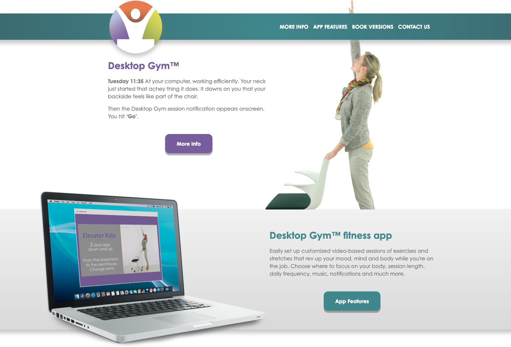
Desktop Gym is a desktop application aimed at all the companies which would like to adopt innovative solutions to improve their employees health. This software is designed for those who work mainly on the computer and thus stay still in the same position for many hours, moving just a few body parts, e.g. hands, and shoulders. The app features videos of easy stretching exercises, designed to release stress people experience during their business hours and that users can perform at their desks. Since working on the PC requires a lot of mental energy as well, exercises goal is to help users keep themselves in both physical and mental shape.
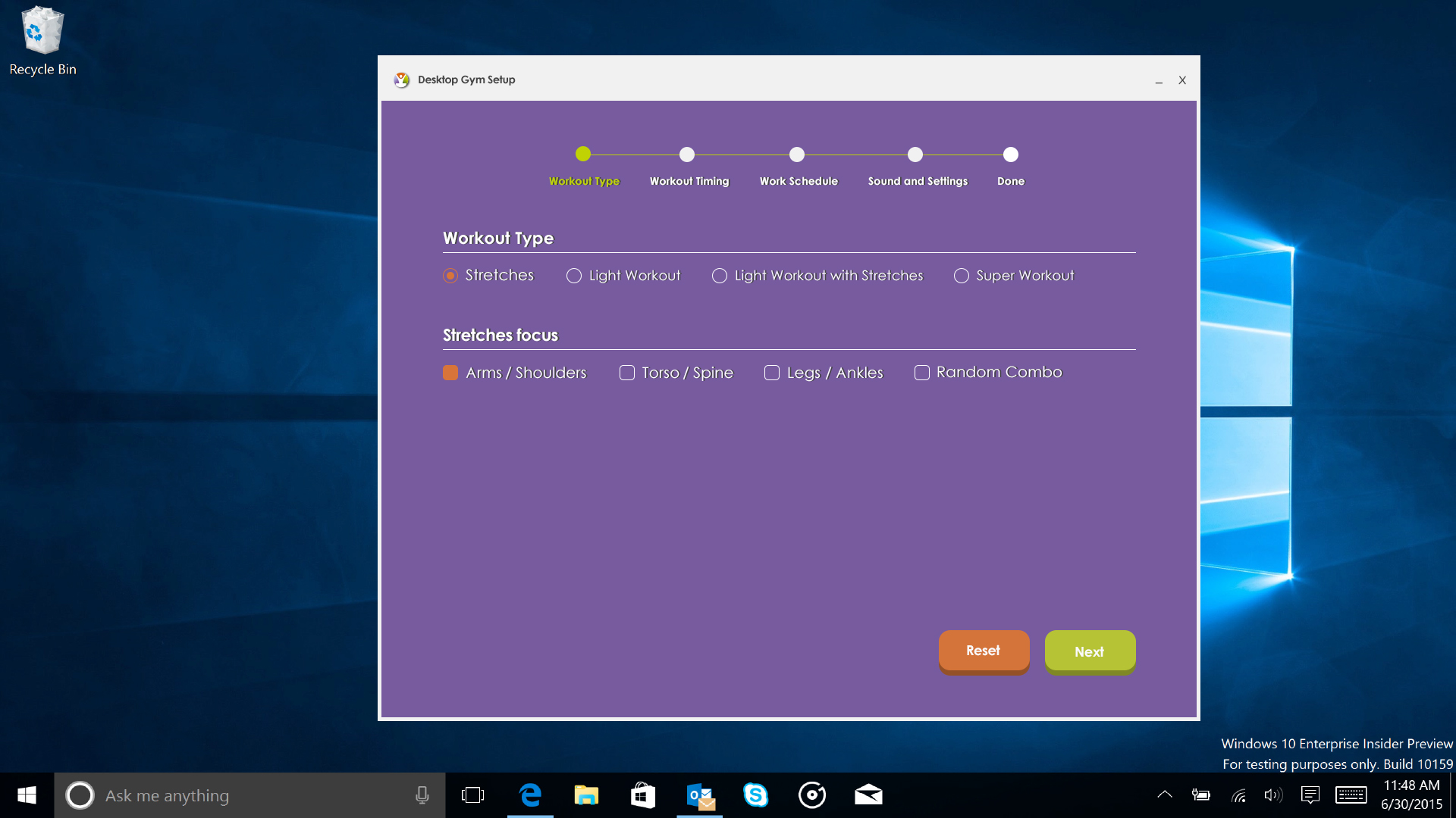
The application is highly customizable: users can set how many times they’d like to exercise, the length of workouts and the body areas where to focus. People can customize audio settings as well, therefore they can choose among audio instructions to perform exercises or music. Last, but not least, they can set a bot that will remind them that it’s workout time.
Our client is a yoga and pilates instructor who previously worked in the marketing field and thus is aware of health issues that all the people who work on the PC for many hours experience. When she got in touch with us she already had clear in mind what she wanted. She came to us providing her guidelines, explained her business vision and handed over a very useful tool for the implementation, a short demo that presented the idea and how the application should have behaved.
We can tell this is a sort of double project as we took care of both the application and the websiteto promote the product itself.
To develop the application we started with UX development, therefore we made a research on the competitors, taking into account the client guidelines and focusing on how other companies managed UX aspects. This step was crucial to discover the best practices in the online fitness business and to collect useful data for the analysis. During this phase, the client collaboration was very important as she provided more information about the potential customers she wanted to reach: big companies that buy services for their employees, were her target.
Then we moved forward with the application’s structure. First, our UX designer mapped all the interaction the user would have, starting from the application setup until people start to use the product actively. Once the key elements of the application were established, it was possible to design wireframes, which have been the tool to discuss how the application had to work. In particular, wireframes were needed to discuss with the team and our client how users would navigate this product.
We created personas, potential type of customers, and analysed their needs and hypothetical behaviour, to develop a tailored solution and to design a clean navigation. Thanks to this method, we were able to create an intuitive product that is easy to navigate and that people can enjoy. Once the UX was defined and approved by the client, it was possible to move forward and to take care of User Interface aspects.
Desktop Gym is more than an application. Besides the videos, our client was making books and e-books, and she needed a website to convey all of these products to her audience. Her website needed a brand new UX design. As we did with the application, we started with the competitors and target analysis. Like as our client requested, we developed a design that reflects the style of both the book and the e-book.
Labelado
Labelado is an online printing service for custom adhesive labels. It is mainly focused upon labels for food & beverage and cosmetics, but it allows people to customize their products as much as they want and thus users can create any sort of label. Besides choosing quantity, size, and shape, users can customize paper, finishing, and wrap up settings.
Labelado's innovative business model is based on the "print-shake", a price discount system connected to groups of clients. The Print-shake mechanism allows people to benefit from maximized discounts to get the label of their dreams at an affordable price, all people have to do is to join a queue created by other customers. The more people join a queue, the higher the discount gets. Print-shake is an option, and users can choose Labelado for their personal orders of labels without opening a Print-shake queue.
Labelado is a startup founded by Federica, Stefano, and Carolina, who belong to a family of printers: three young creative minds who take care of every aspect of the printing process and guarantee a high-quality service.
Despite their young age, they had clear in mind some of the key elements for the project development since the start. They shared with us their ideas, the user journey map during the purchasing process they designed and all the settings the app should have featured. Moreover, they provided a list of Italian and international competitors and for each of them they pointed out the strength points and the weaknesses.
Competitors analysis, which has been the first step for UX development, has been crucial from different points of view. To design a high-quality platform, we invested mainly in research, a choice that allowed us to save time later. Besides studying the websites the client provided, we analyzed many others and we collected information about the best practices adopted by online shops of other industries.
Not only we studied competitors from a UX point of view, but we also analyzed them taking into account a strategic point of view. This analysis was useful to understand how to place Labelado within the market: was it better to create a specialized service or a multi-service platform? During this phase, our clients were involved to define the values to convey through the website, the “reason why” users should use Labelado, the target group and the marketing objectives.
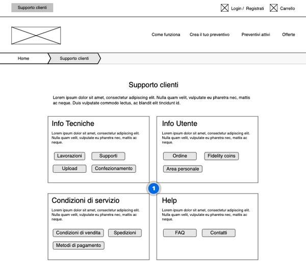
All the information we collected allowed us to move forward with both the website and the application functionalities. Since Labelado business model differs from existing printing online shops, information architecture, UX and main functionalities had to be designed and coded from scratch. One of the challenges we had to face, was how to guide non-experts of label printing through a platform that features very specific settings, like as labels wrap up. Our solution was a huge support section where people can find information about paper types and paper quality, finishing processes, how to upload their graphics, etc.
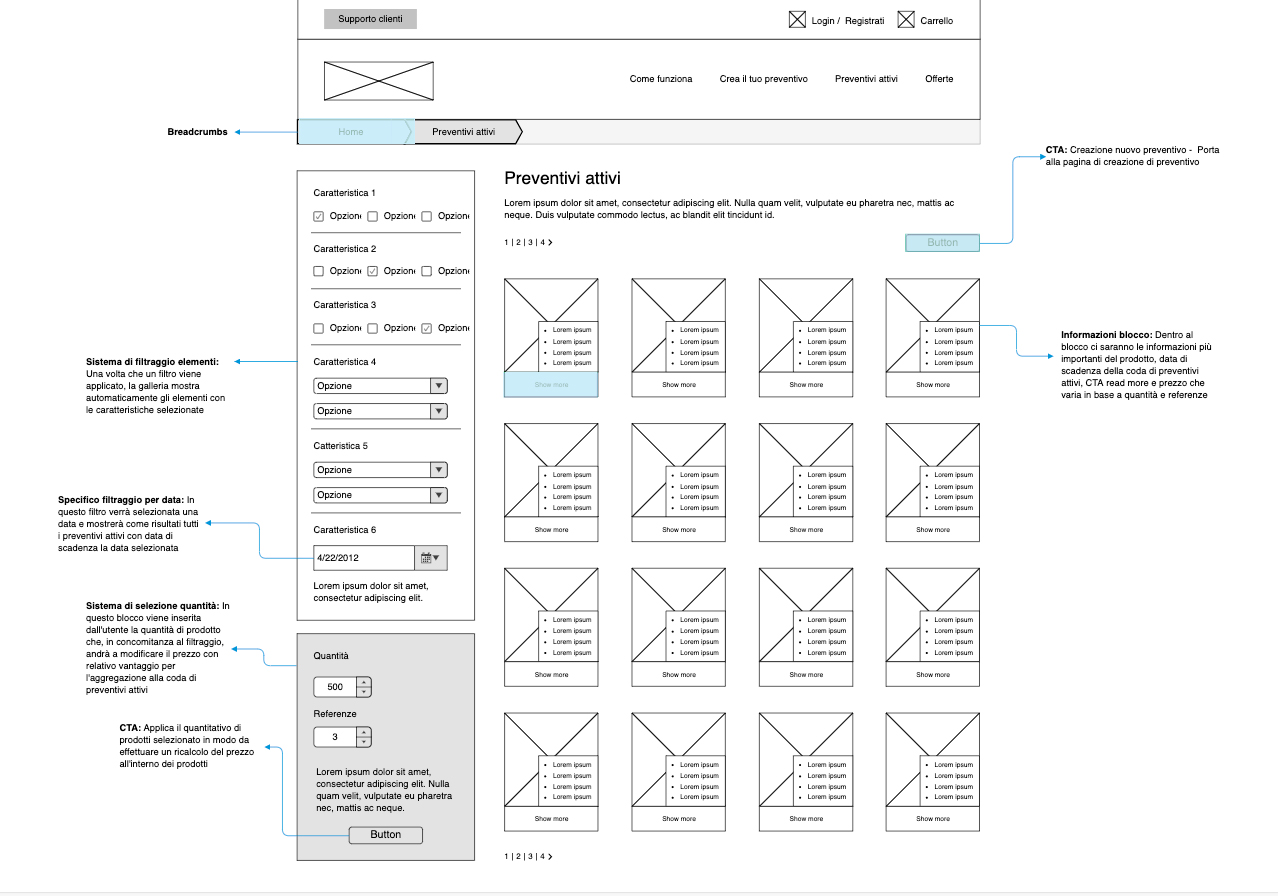
UX and design had been carried out together with the Nephila communication department cooperation. Content analysis, content writing, and a deep connection with the client had been a trait of this project, with a project manager dedicated to this part of the website.
UX, design and development had been exclusively agile, based on a SCRUM workflow. After these iterations we moved on with wireframes design, the first release included the wireframes of the main pages and a functional prototype with no graphics. Both the wireframes and the prototype have been the milestone for ux development. These tools, in fact, were necessary to show our clients how the choices made would let the users navigate the website.
Our UX designer developed the UI starting from the home page, then produced, in addition to the design, a style tile, both useful to show the customer the choices that were made and to provide the development team elements of atomic design and the rules for implementation.
Would you like to learn more about projects development process in Nephila? Keep following our blog and have an in-depth view by reading our case studies!

